Campus Collect
Designing a Student Marketplace for Seamless Buying & Selling
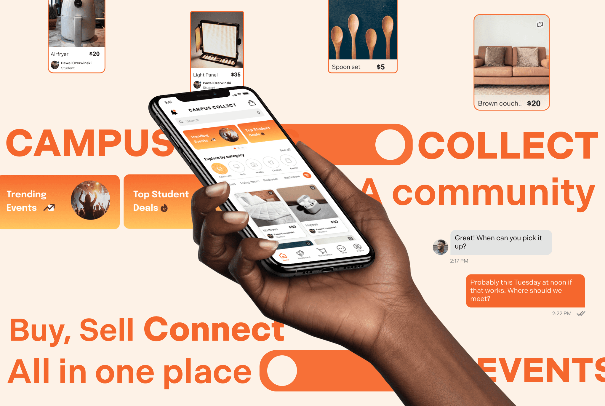
Campus Collect was designed to streamline student transactions—whether it’s finding a side gig, scoring a deal on secondhand textbooks, or selling a dorm couch before moving out. More than just a marketplace, it’s a student ecosystem that combines a job board, marketplace, event tracking, messaging, and content discovery into one intuitive experience.
Company
Campus Collect
Services
Web Design
UI & UX Design
Industries
E-commerce
Duration
Nov 2024- Present
When I stepped in, the goal was clear: design a seamless, student-friendly platform that made buying and selling effortless while fostering trust within the community. As a UX/UI Designer, I worked on designing key parts of the experience, including the homepage, buyer and seller profiles, item collections, settings, interest tags, short-form content for promotions, and a streamlined onboarding process. The goal was to make Campus Collect simple, engaging, and built for student life.
Students were struggling to manage everything in different places. They relied on a mix of apps, group chats, and bulletin boards to buy and sell items, find gigs, and keep up with campus events. This made transactions and connections feel disorganized and inefficient.
Campus Collect needed to solve this by creating a centralized, student-friendly platform. Key challenges included:
Making the homepage engaging, with easy access to listings, trending products, and student discounts.
Designing profiles that build trust, featuring reviews, item collections, and interest tags.
Creating a fast, intuitive onboarding experience so students could get started quickly.
Developing a short-form content feature to help users promote their listings and services more effectively.
The challenge was to design an experience that felt seamless, intuitive, and tailored to student needs.
The challenge
My approach
02
I started by researching how students currently buy, sell, and job-hunt online. Many relied on multiple platforms (Facebook Marketplace, LinkedIn, campus bulletin boards), but switching between them was inconvenient. Campus Collect needed to unify these experiences.
Through user surveys, I identified key frustrations:
Too much friction in setting up profiles. Students wanted to start browsing immediately.
A need for trust signals. Buyers and sellers needed better profile visibility to build credibility.
Event discovery should be effortless. Students preferred personalized recommendations based on interests.
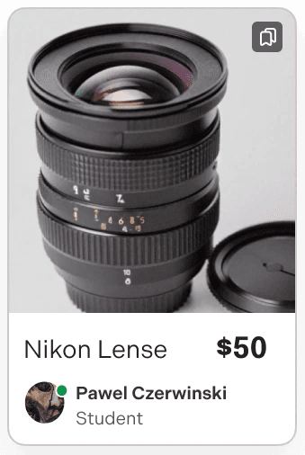
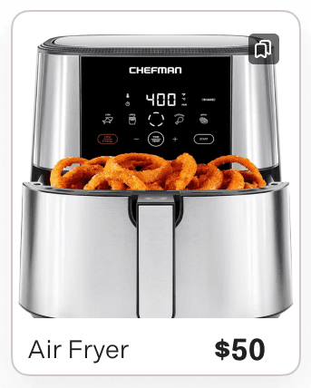
A Homepage That Prioritizes Discovery
The homepage was designed to surface the most relevant content upfront:
- Newly listed items to keep the marketplace active and fresh.
- Trending products so students could see what’s popular.
- Student discounts to highlight exclusive deals.
The layout made browsing effortless, helping students explore without feeling overwhelmed.
Refining the Experience: Iteration Through Feedback & Testing
Building a great product is an ongoing process of learning, testing, and refining. Through internal reviews, beta testing, and stakeholder feedback, we continuously improved the homepage to create a more intuitive and visually consistent experience.
Key updates in the second version included:
✅ Saved Icons and no borders on Item Cards – Added saved icons that easily indicate which items users have saved, and improve browsing clarity. Eliminating the border allowed the product images to feel more integrated into the rest of the app.
✅ Like Buttons for Promotional Content Only – Creating a clear distinction between saved items and engagement features.
✅ ‘See All’ Button for Categories – Enhancing discoverability and access to more listings.
✅ Icons for Item Category Bubbles – Making categories more visually intuitive and easy to navigate.
By embracing iteration, we transformed the homepage into a more user-friendly and engaging space, ensuring that every change was backed by real user insights.
Before second version:
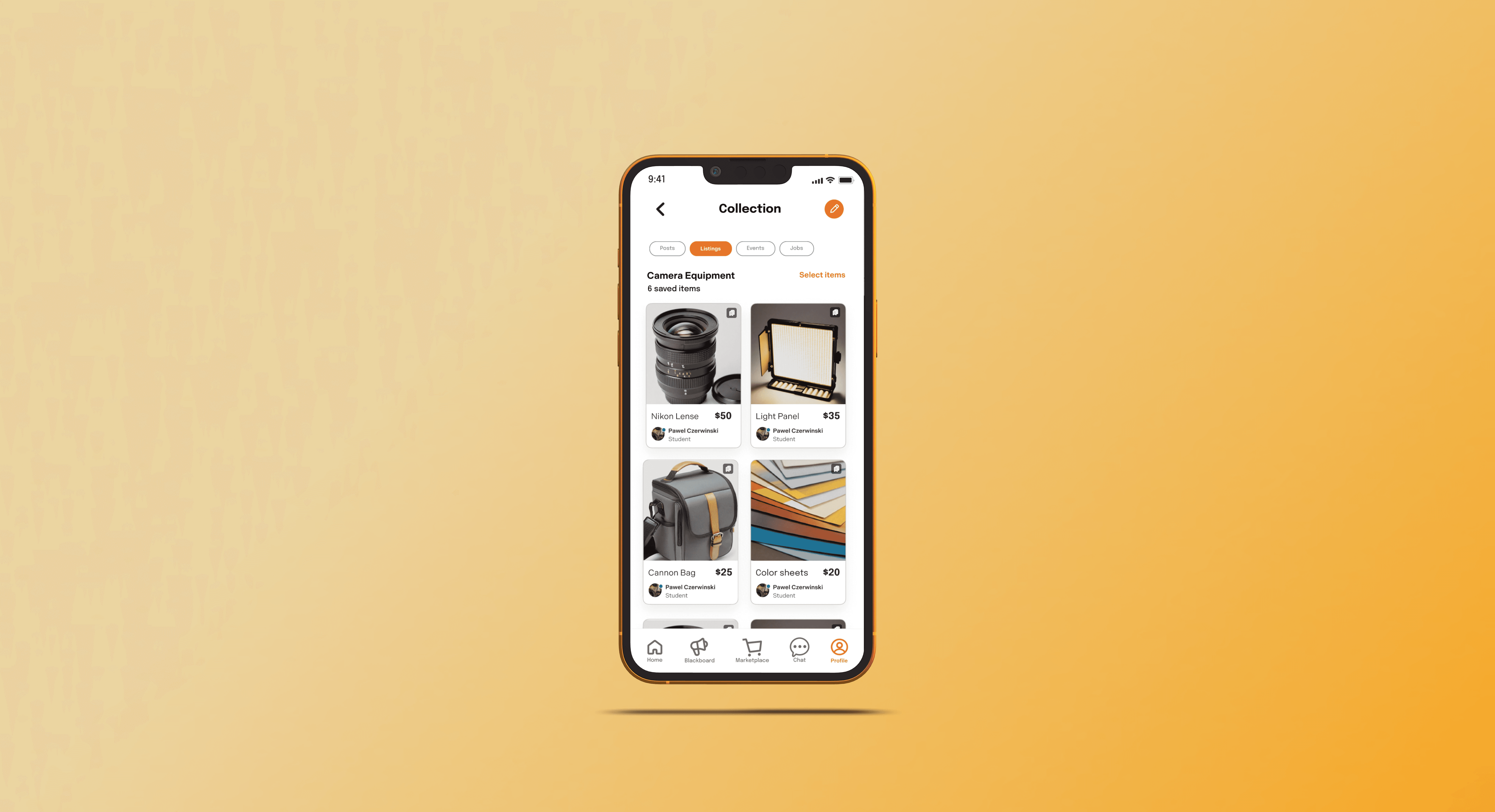
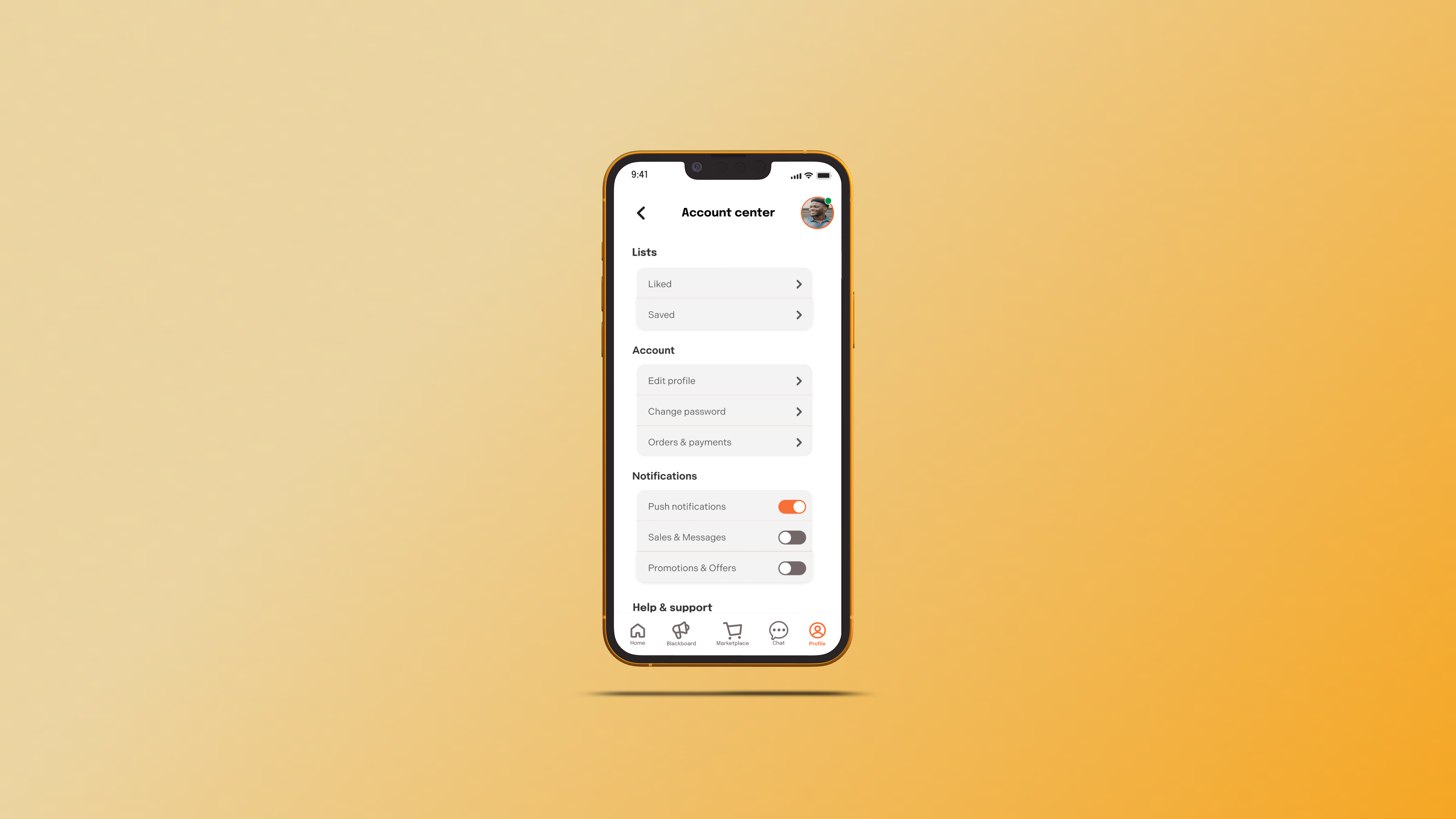
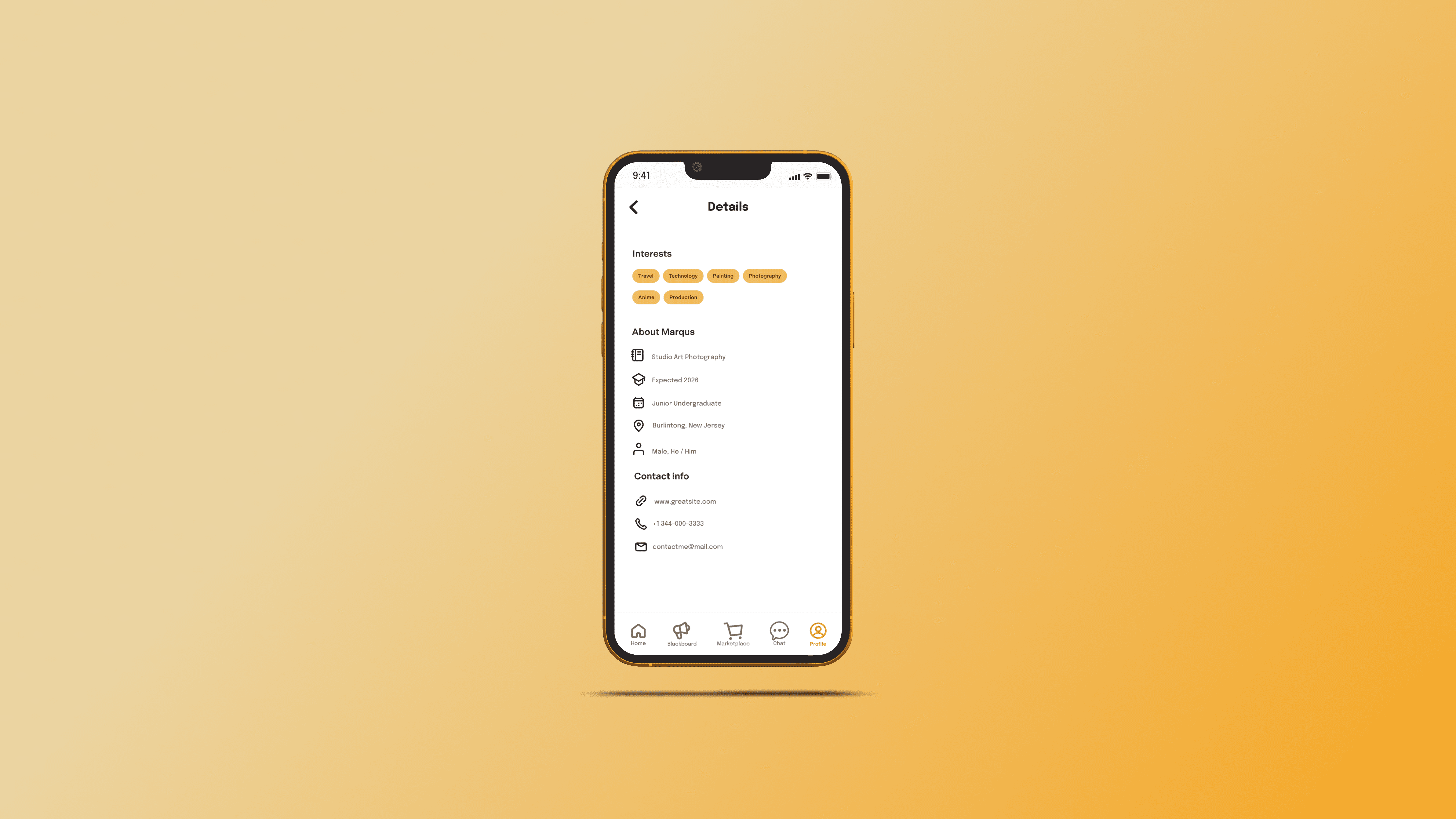
Profiles That Create Trust
Buying and selling within a college community requires a sense of security. I designed:
- Reviews: so students could see seller ratings before making a purchase.
- Item collections: to help users organize their listings and saved content.
- Interest tags: to personalize the experience and surface relevant content.

ORGANIZE
All in one place
YOUR
FINDS
Tailor your
EXPERIENCE
Customize, Control, and Stay in Sync Efforlessly
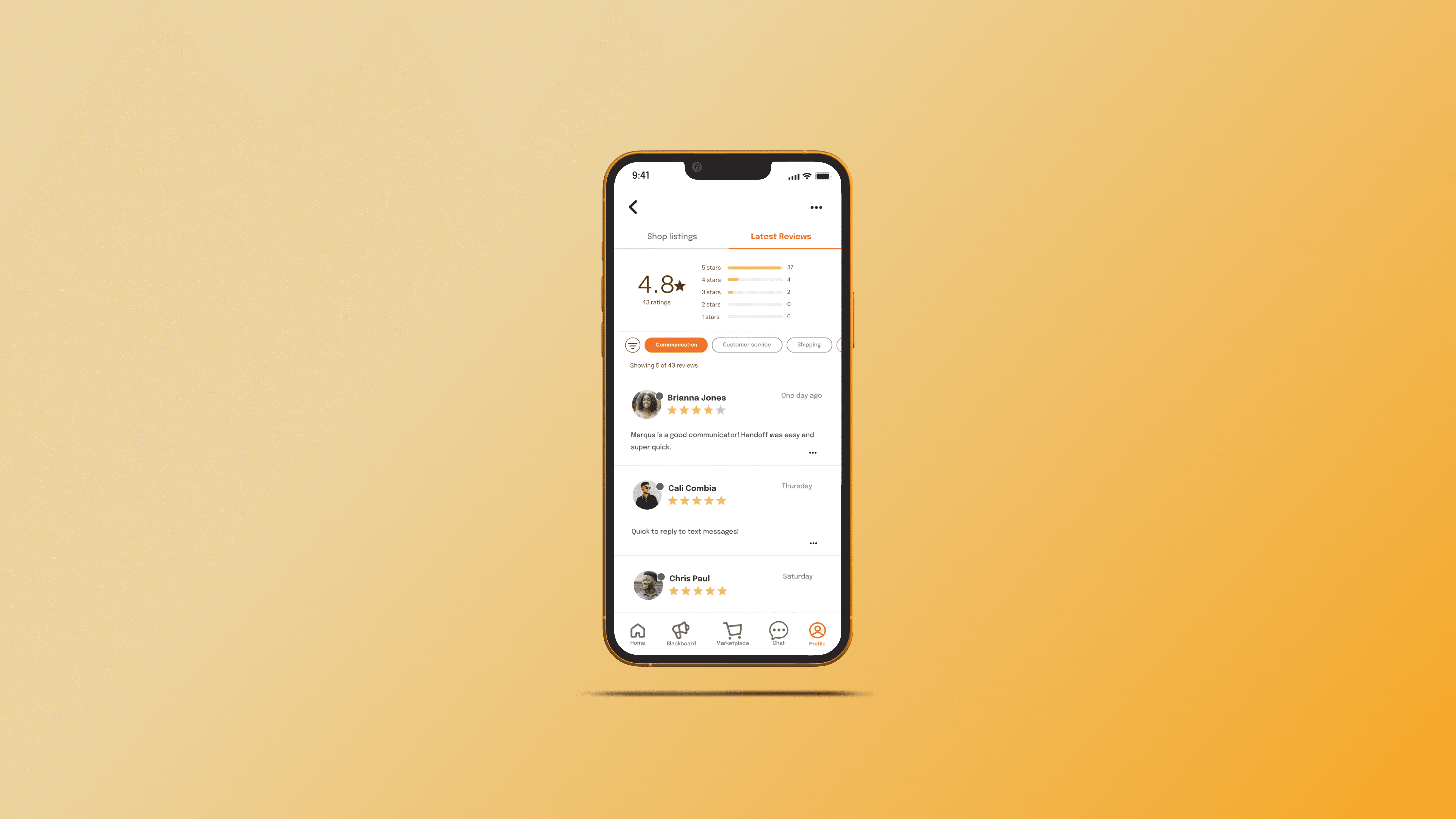
RELIABLE
REVIEWS
Happy users


Craft your
BROWSING
Interest tags that make our app yours


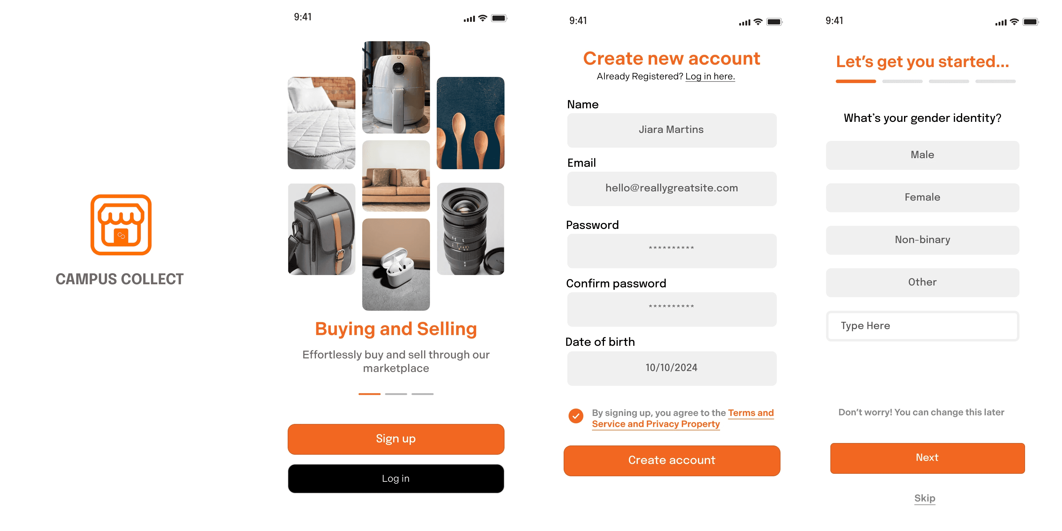
A Streamlined Onboarding Experience
I simplified the sign-up process to make it as quick and painless as possible, ensuring students could get up and running without frustration.
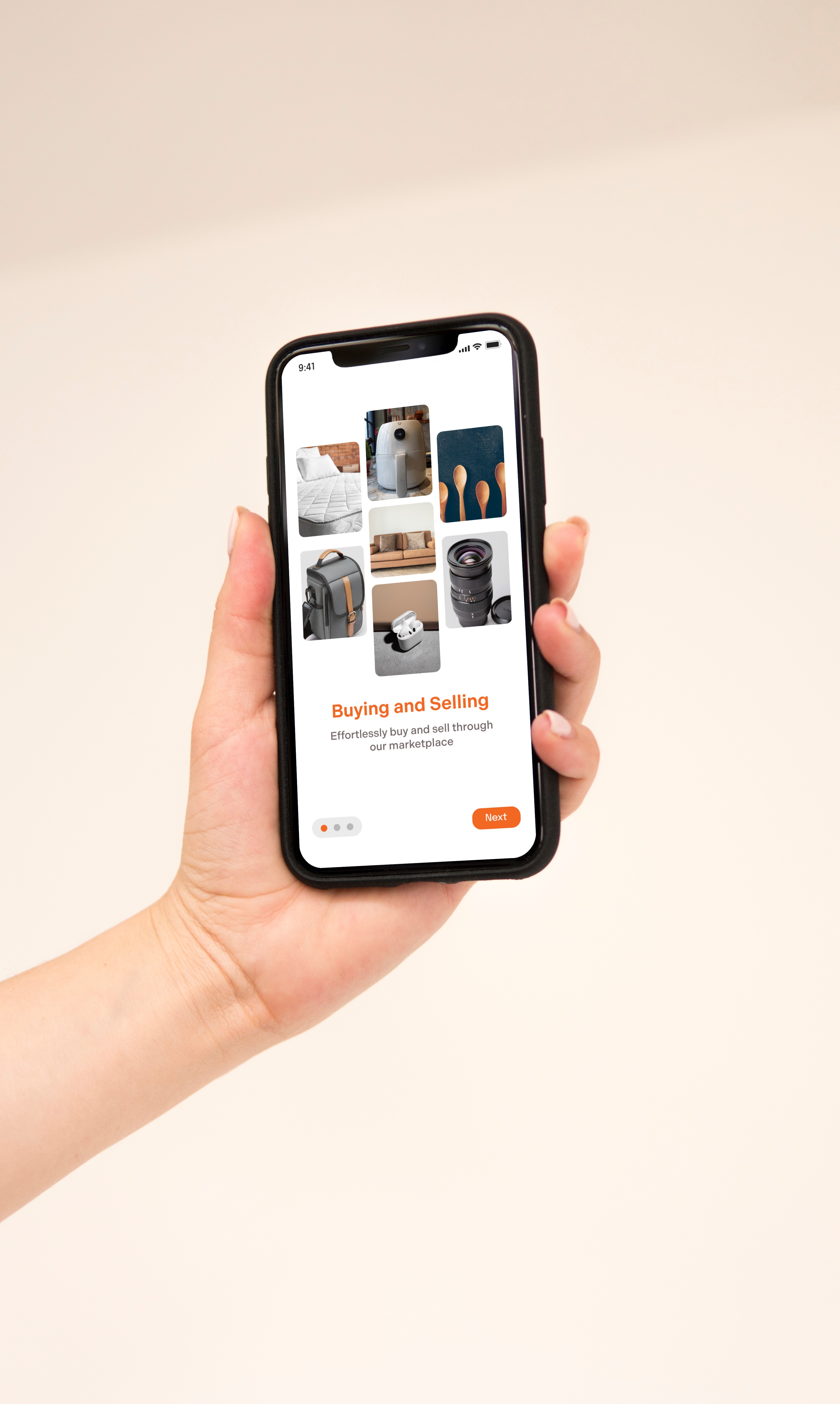
The first version of onboarding had poor UX due to its 13-step process, with each screen asking just one question. This unnecessary fragmentation increased cognitive load, forcing users to process and respond to information one step at a time instead of in a more natural flow. The excessive clicks made the process feel tedious and frustrating. A more streamlined approach—grouping related questions together—would reduce cognitive load and improve the overall user experience.


I streamlined the onboarding by grouping related questions, reducing unnecessary screens, and making the process more efficient. This helped lower cognitive load, making it easier for users to complete onboarding quickly without feeling overwhelmed. The improved design also created a more intuitive and engaging experience, ensuring a smoother introduction to the platform.

Short-Form Content: Driving Engagement & Visibility
To make Campus Collect more dynamic, I introduced short-form content to help students promote their items and services. Instead of static listings, users could create quick, engaging posts with images, captions, and tags—boosting visibility and interaction.
Key improvements:
Promotional Content – Users can highlight items, gigs, or events in a scrollable feed.
Like Button – Engagement signals help surface popular content.
This feature gave students a way to market themselves effortlessly, making Campus Collect more than just a marketplace—it became a hub for student-driven commerce and community.
Next steps & Learnings
03
Working as a UX designer at Campus Collect, a fast-paced startup, has been an invaluable learning experience. As a junior designer, I’ve had to quickly adapt to shifting priorities, collaborate cross-functionally, and make design decisions that balance user needs with business goals.
This experience has reinforced my belief that “Good design is the new people science.” Understanding user behavior, motivations, and pain points has been just as crucial as visual design. By approaching UX with a research-driven mindset, I’ve been able to craft solutions that are both intuitive and impactful.
This project taught me:
Iterating Rapidly – In a startup environment, speed is key. I learned to gather feedback, test solutions, and refine designs efficiently.
Balancing User Experience & Business Needs – While designing for usability, I also had to consider technical constraints and company objectives.
Handling Ambiguity – With no existing platform to build on, I had to define user flows from scratch, making research and iteration essential.
Effective Communication – Presenting design decisions to stakeholders and working closely with developers helped me refine my ability to advocate for users while aligning with team goals.
Moving forward, I plan to continue refining the onboarding flow, incorporating more user personalization, and conducting further usability testing to enhance the experience. This project has strengthened my confidence in designing with agility, collaboration, and a user-first mindset.